For some, visiting an art exhibition can be a peaceful and awe-inspiring experience. Filled with sensory pleasures, creativity and innovative ideas. However, for some it can be an overwhelming sensory experience, with confusing behavioural expectations and a visual overload.
Photographs taken at the 21st Biennal of Sydney: Superposition Equilibrium & Engagement, Installation view Museum of Contemporary Art Australia 2018
So how can you make an exhibition or gallery inclusive and accessible for all?
In 2018, the Museum of Contemporary Art (MCA) worked with Autism Spectrum Australia to make a few small changes to their Biennale exhibition and created an autism friendly gallery experience for children and families.
Here is what the MCA learned.
Prepare visitors for what to expect
People on the autism spectrum feel more comfortable when they know what to expect.
- Being able to prepare for themselves for what's coming can make a big different to how they feel.
The MCA developed a range of additional resources, such as a web-page containing visual stories - using real tangible photographs.
- This allowed for a true representation of the details of the event in easy to follow steps.
This visual guide helps families and other visitors prepare for the visit by familiarising themselves with the space and behavioural expectations.
Give the visitors the information they need to make a choice that's right for them
In a space where light, sound and textures are used for impact, it was important to consider any sensory stimuli in the environment. Supported by Aspect's inclusion advisor who is on the autism spectrum, a number of changes were make to the exhibits.
- Sensory adjustments such as turning off sound or modifying lighting were made to the exhibits themselves and the surrounding gallery.
- This was the first time changes had been made to an exhibition in this way
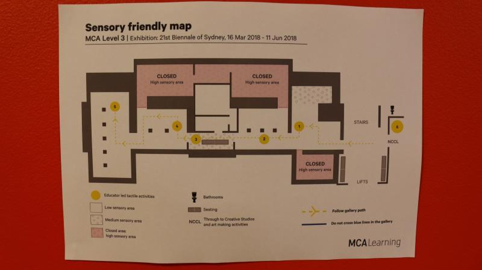
To support visitors, the team at the MCA designed a sensory map (See image below) which identifies the key sensory components of the gallery such as: low lighting, flashing lights, etc.
- This gave families choice and control over their visit, allowing them to avoid certain exhibits which might not be comfortable for them.
Create Visual structure in the environment
When entering the exhibition at the MCA, there are a number of different pathways and routes to choose from. This can confuse the public as to where they should be heading.
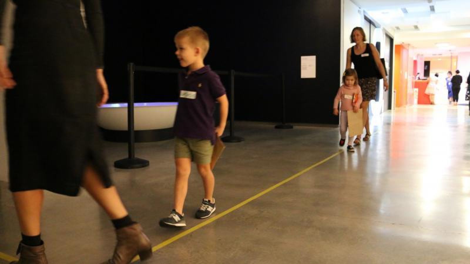
- Marking a yellow path (See image below) on the gallery floor for visitors to follow, allowed them to move through the gallery with ease, and it made it fun!
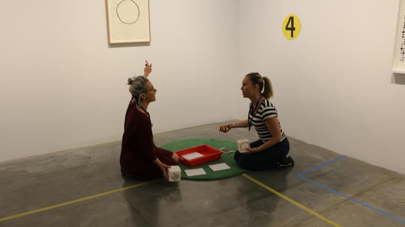
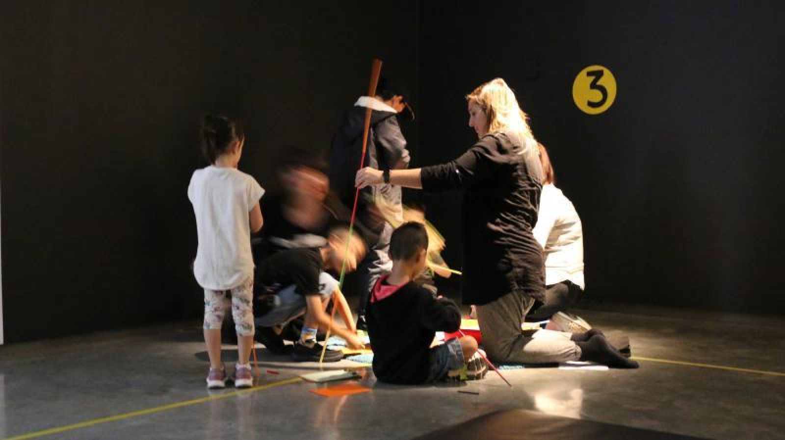
As visitors follow the path, they arrived at a number of art stations. These were clearly identifies by a colourful rug and number on the wall (See image below).
- All of these visual structures were there to help the visitors feel comfortable and know that they were on the correct track
- A second blue line was also marked on the gallery fllow, providing a visual clue to remind guests not to get too close to the artwork!
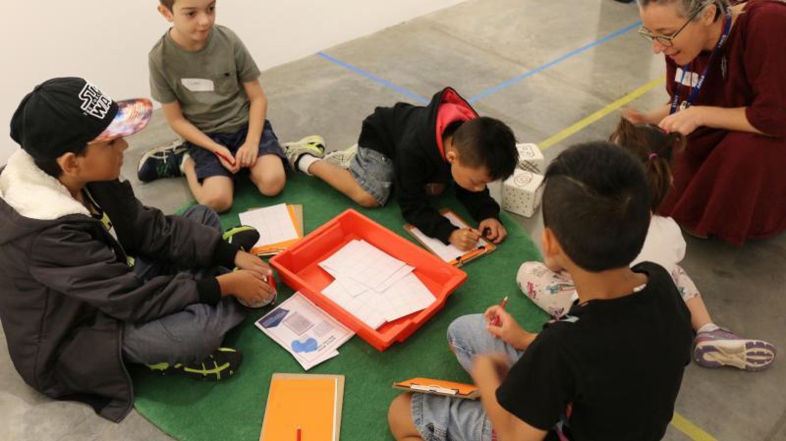
The MCA are keen to encourage young people to engage with contemporary art. To help visitors feel engaged with the art without having to touch it! Interactive tactile experiences were provided for visitors to enjoy at each art station.
- Each art station responded directly to the art and had a range of activities and games for the visitors to engage with
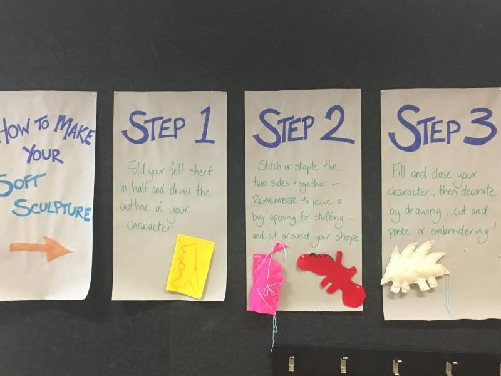
Visual structure (See image below) was also embedded within the activity workshop. The activities were outlined step by step and demonstrated to all participants.
Establish expected rules of behaviour!
What is the one rule when visiting an art gallery?
Don't touch the art!
However! This isn't always as easy as it sounds, especially when lots of the art displayed openly within a reaching distance - it can be hard to resist!
For their relaxed gallery opening, the MCA wanted to make it as easy as possible for the guests to follow this rule. Staff replaced the 'do not touch' sign with a simple rule 'Hands behind your back.' This was explained to the families before they went into the gallery.
It is always easier to follow the rules when you know what you are expected to do, rather than what you're not supposed to do!
Flexibility
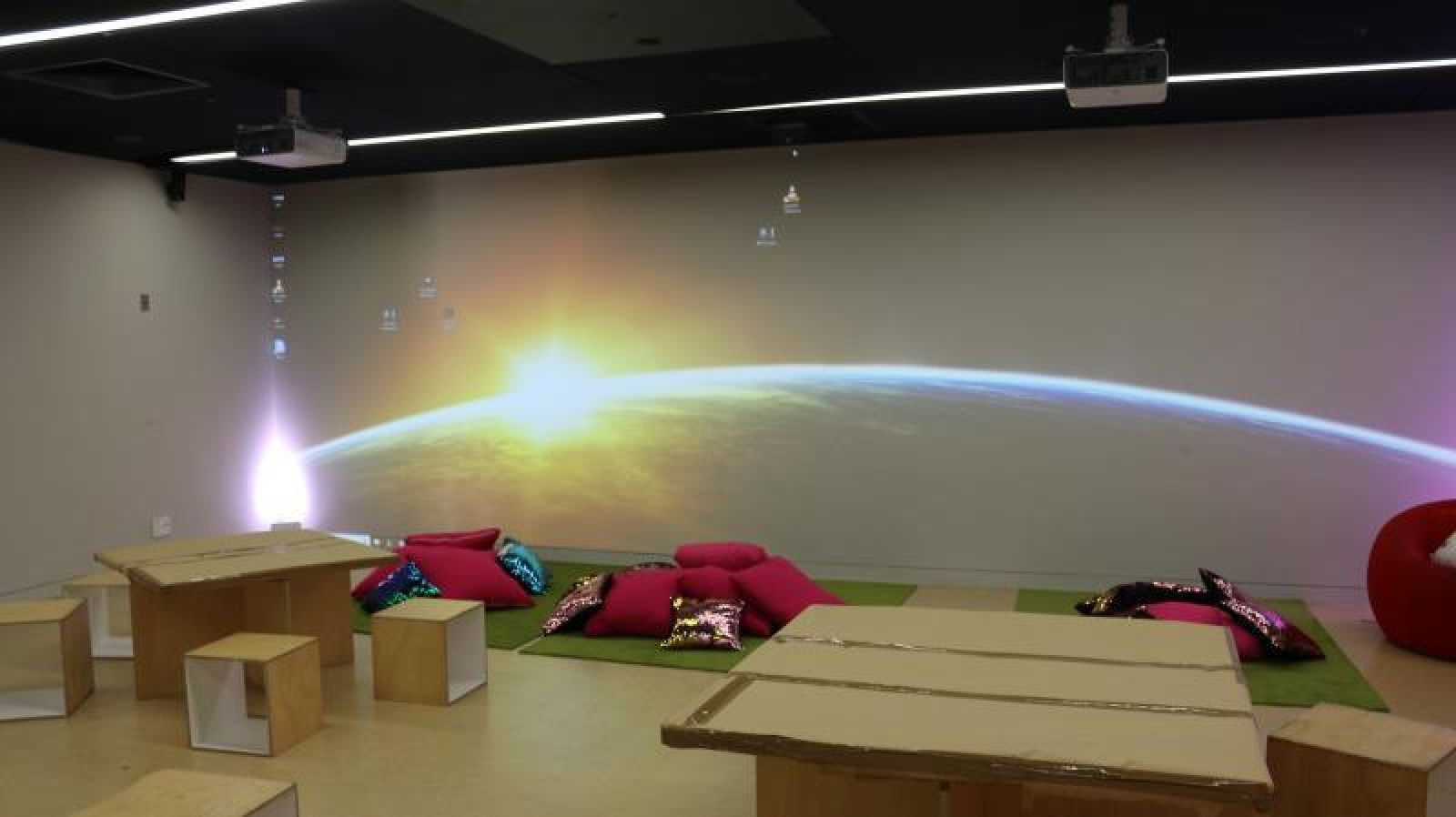
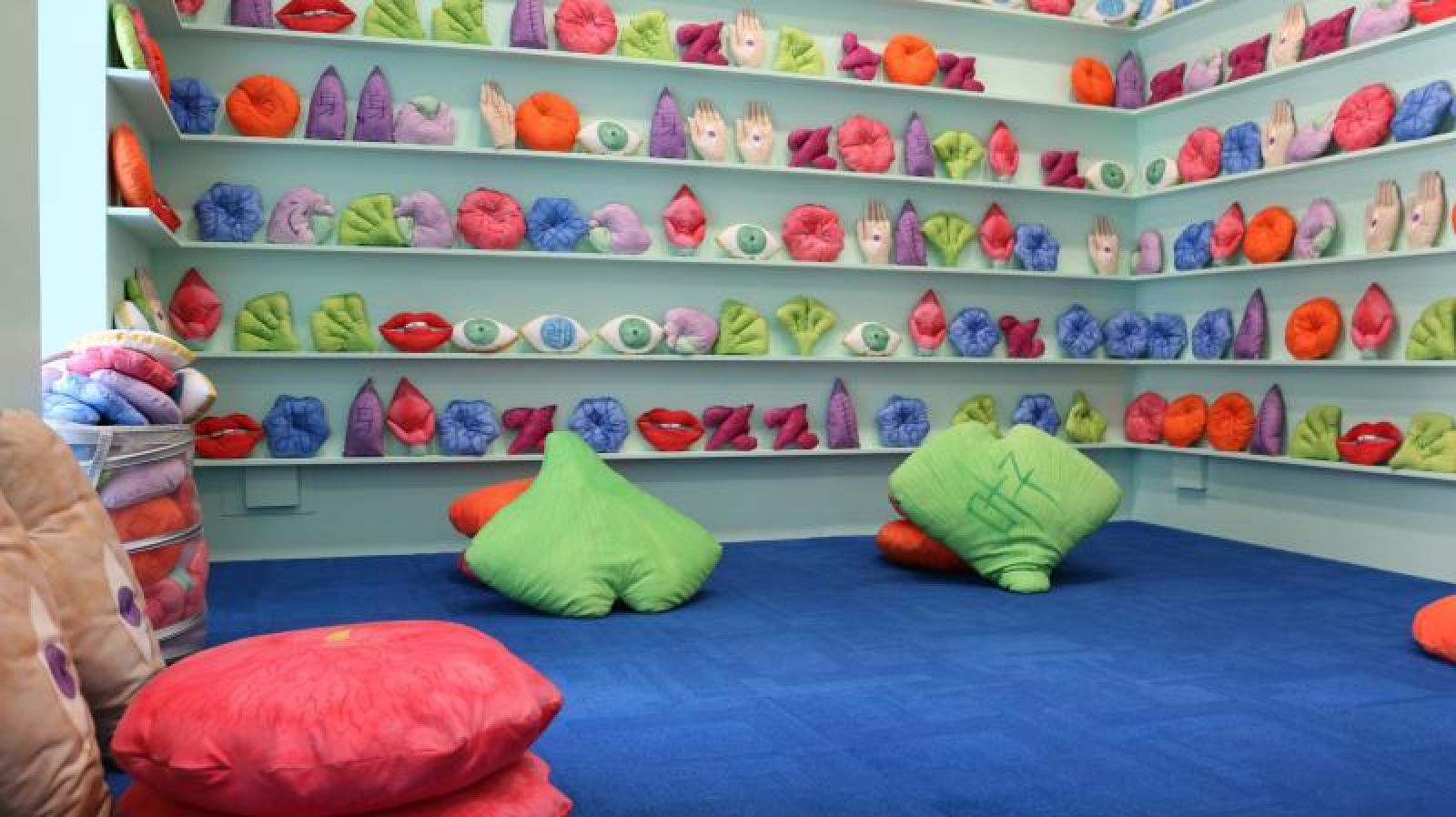
Embedding all of this structure and preparation into the event made it easy for visitors to get involved, and run through activities that were planed. But just as structure is key, so is flexibility. The welcoming and flexible nature of all MCA staff really made the event an inclusive and highly personalised experience. this was immediately apparent within the quiet room, and the Bella room.
By providing chill out spaces, quiet rooms and sensory play area, the MCA made sure that everybody felt welcomed and supported, and that nobody on the autism spectrum was left behind.


